Learning the Visual Elements of Design {Photography} Guest Post
This post may contain Amazon or other affiliate links. As an Amazon associate, I earn from qualifying purchases.
You’re in for an extra special treat today! My sweet friend Sylvie has agreed to do a little guest post about Photography and the visual elements of design. If you’ve never been to Sylvie’s, blog, Gourmande in the Kitchen, you don’t know what you’re missing. Not only is it full of fabulous recipes but her photography is like candy for your eyes! She’s a brilliant photographer and food writer. I learn something from her every time we chat. People pay good money to learn what she’s willing to share!!………..grab your cameras and let’s get started!
Tips for Food Photography
Learn the basic elements of design of composition for successful and harmonious composition in food photography.
The Language of Photography Part I: Learning the Visual Elements of Design
At the core of all photography lies subject, composition and lighting. If those three things are poor, no amount of post-processing work will fix it. It won’t matter what your aperture, f/stop or ISO is if you don’t have an interesting subject, good composition, and great lighting. Without these, a photo will lack impact.
Learning how to effectively read a photograph will give you better insight into how to achieve those crucial elements in your own work.
Reading a photograph is the study of how a particular image was created and the thought process of the photographer behind it. Photographers constantly make decisions about lighting (quality and quantity), composition (the arrangement of visual elements) as well as content (subject and meaning) when taking photographs.
Every image offers a variety of interpretations and by observing and interpreting the choices a photographer has made in each we can learn and improve our own skills. To become better photographers, we have to spend time looking at what other photographers are doing and learn from each other.
Of course, you may already instinctively know what you like, but by learning how to analyze the basic visual elements a photographer uses to communicate with, you will better appreciate and understand what you like or don’t like about a particular image.
As I mentioned, a successful image depends on a number of things that must come together including: lighting, composition, and subject matter, but for part I of this discussion I will be focusing on the basic building blocks of all visual arts – the elements of design.
Keep in mind that understanding these various elements are only guidelines and you should also follow your instincts. Don’t be afraid to experiment and try something different, learn from your successes as well as your failures. Surround yourself with others that share your enthusiasm and you will improve your skills quickly.
The Visual Elements: Not all of the elements may be present in an image at one time. What you choose to include or exclude makes up the elements that engage a viewer’s attention.
- Lines: Lines are effective visual elements because they lead the viewer’s eye. They draw the eye to key focal points in an image; they imply motion and suggest direction. A line can be straight, curved, vertical, horizontal or diagonal. A line can be implied when several points are positioned strategically within the frame. Through linear perspective, lines can also create a sense of depth to an image. Generally a vertical orientation is used for images with predominantly vertical lines and horizontal orientation for images with predominantly horizontal lines.
Question: What lines do you see; how they are arranged within the frame of the image, where is your eye drawn?
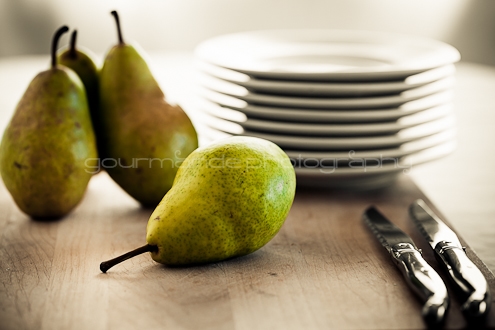
- Form/Shape and Space: Forms are three-dimensional shapes; shapes can be irregular and organic (as found in nature) or geometric (ex. circles, triangles, and squares). Space is defined and determined by forms and shapes, it is the area between and around objects. The shapes in an image create positive space, while the spaces around these shapes are the negative spaces. It is important to be attentive to the negative space as well as the positive space. Increasing or decreasing the amount of space around an object affects the image. Shapes can be made more dominant within a composition by placing them against a contrasting background.
Question: Do you see organic or geometric shapes; what are they, how do they impact the image?
- Color: We respond to color on many levels. Color defines and accentuates lines, shapes, forms, and space. Color can add interest and draw the eye to the focal point or, conversely, can distract the viewer away from it when used incorrectly. Color also impacts mood; certain tones have a calming effect, while others convey vibrancy and energy. There are three main components of color: hue (the shade of a color), value (the lightness or darkness of a color), and saturation (how vivid and intense a color is).
Question: What colors are used in the image; bright or muted, light or dark, how do they affect the mood?
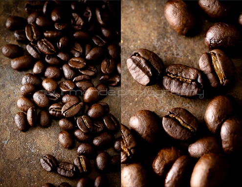
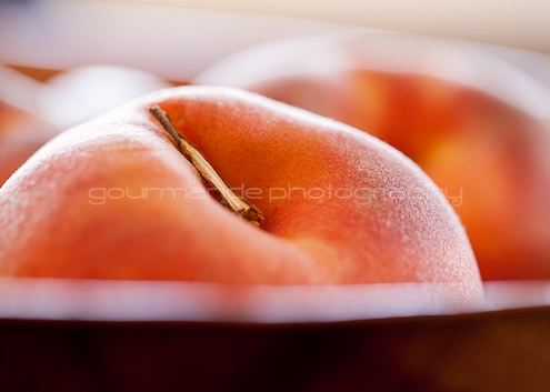
- Texture: Texture is the surface quality of the objects in the image. Textures can be rough or smooth, soft or hard. We experience actual texture when we touch objects and feel their roughness, smoothness or patterns, which we can simulate or imply in a photograph. Textures are highlighted when light hits objects from different angles.
Question: What textures are highlighted; how do they work with the other elements?
These elements of design are the basic components of composition; they are the structure of the image and provide the photographer with a set of tools to begin working with. A successful and harmonious composition is achieved by integrating these basic tools with the concepts of the principles of design which will be the subject of part II of “The Language of Photography” and the beginning of a series on photography and food photography on my blog Gourmande in the Kitchen. I hope you will join me there. Thank you Cheryl for having me here today!
About Sylvie:
Sylvie Shirazi is a freelance food photographer and food writer. On her blog, Gourmande in the Kitchen, she celebrates the joy that food brings to our lives every day. Her motto is “cook simply.” She believes that good food isn’t fussy or pretentious; it’s simple, it’s real and it’s made with love for those we love. Through her blog, Sylvie hopes to inspire others to follow their instincts, trust their taste buds, and find a sense of confidence in the kitchen.
Connect with Sylvie on Twitter | Facebook
Tidymom is a participant in the amazon services llc associates program, an affiliate advertising program designed to provide a means for sites to earn advertising fees by advertising and linking to Amazon.com.
Please respect my work, recipes and photographs. If you do use a recipe in your own writing, please give proper credit and link back to the original post.


Thanks so much for the great information – I’m such a newbie at blogging and photography and I try to absorb all I can about photography from nice bloggers like you who share.
One question: My house is heavily surrounded by trees. There is no time in the day that any spot in my house (except my bedroom) has natural light. As a home decor bloggers, how can I overcome this problem? e.g. I’m photographing a table setting in the dining room … and it’s too dark to get good pics. Turning on lamps creates glare.
Thanks so much!
If you have to shoot indoors because you need to set up on your dining room table, then you may need to invest in a tripod to allow you to shoot at very slow shutter speeds or look into artificial lights. A super easy and inexpensive method would be to purchase daylight balanced bulbs and simple clamp lights at a hardware store and start with that.
Mary, I have the same problem with the lighting in my house. Everything I read says to use natural available light but that’s usually not an option for me. I’d love some tips on how to work around that issue. Right now I seem to get the best pictures in my fluorescent-lit kitchen by adjusting the white balance on my camera accordingly, but those pictures definitely lack the pop of the ones in this post.
That’s because overhead lighting isn’t the best, try the daylight balanced bulbs and clamp lights I mentioned. They will better allow you to control the direction of light.
“Trust you instincts” “Learn from others” “Analyze”
I love this guest post. Sylvie is a pro at what she does. I respect her skills immensely and she is a wonderful person.
Great tips and I will refer back to this post often.
Sylvie is one of the most talented photographer I know. Love her unique style of photography. Very well written post indeed. Can’t wait for the part II
I absolutely adore Sylvie and her skills are beyond amazing!!! Love this post.
Sylvie photography is mesmerizing. She pushes me on to look at things differently and try to improve. Thanks for the info!
Fabulous guest post! I love Sylvie’s photos. They are always amazing! Thanks for sharing!
Love Stlvies photos and so glad you hosted her here! Can’t wait for more food photography posts!
I will definitely bookmark this post for my references… Tq for the great write up. And waiting impatiently for Part 2 🙂
WOW – Gorgeous photos!
Beautiful and packed full of useful information – thanks Sylvie.
Great tips from a fave photographer. Thanks for sharing your knowledge, Sylvie
Informative and so well written-great post! I can’t wait to read the subsequent parts of this series.
Excellent!! This is a terrific explanation of the various elements that go into a photograph!!! I seriously can’t wait to read the next installment!
What a wonderful guest post! I just love Sylvie’s recipe and photography SO much. What a treat to have her share her insight here.
Sylvie is a great inspiration. There is so much to learn from her. Thanks for sharing this wonderful piece of information on food photography. You have made it look simple with your amazing writing skills.
wow, this is FANTASTIC!!!
I love this. It makes me strive to improve my photography but at the same time frustrates me a little because I have so much to learn. Thank you for this
I love Sylvie’s blog, and I often go there just to stare at her stunning photos. Thank you, Sylvie, for sharing these tips with us!!
LOVE this. absolutely beautiful photography and great information. Thanks to both of you!
Great information and gorgeous photos. thank you 🙂
Thanks so much for taking the time to do this post, Sylvie!! It’s so well thought out and explained.
I LOVE your photos…your talent always amazes me!
Great tips! I am always amazed by Sylvie’s stunning photographs… She’s so inspiring!
Very informative thanks
am such a fan of your work Sylvie – always love your photos!
Wow, gorgeous post!! Thanks for introducing us to Sylvie… sorry, I guess I’ve been living under a rock!!
Sylvie is a gifted photographer and stylist and is an inspiration to me. Thanks so much for sharing all these wonderful tips, especially that of looking at what other photographers are doing and learning from each other. There is so much to learn to help improve my photography.
I adore Sylvie and her blog, her photos, and her perspective! Thanks for sharing, Cheryl!
Sylvie’s photos are AMAZING! thanks for having her share a little of her brilliance! I hope it rubs off on me….even just a little! 🙂
HANGING on every single word!
I need to read this over and over again…so much good info. Thank you, both!
Very inspiring! I always take a long look at Sylvie’s photos they are beautiful! Thanks for sharing.
great post . I am not a photographer but as a food blogger, I am learning new photography tips and tricks everyday when I come across bloggers like you who share the love. I appreciate it.